We let Claude Fable analyze football penalty data. Here's what it found
Hi, this is Vivek, building Contextflo. I share practical notes on getting answers from your data, a couple of times a month.
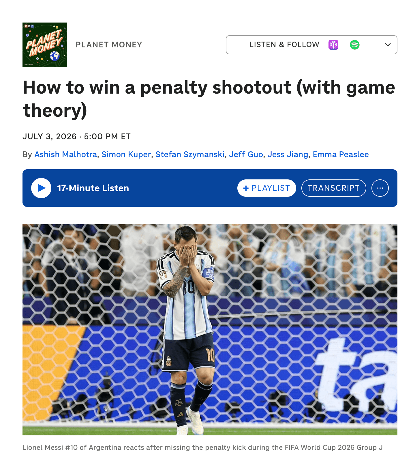
Planet Money ran an episode on the game theory of penalty kicks, pegged to Messi's miss at the World Cup. The claim is a good one, and unusually, it is checkable.
Every penalty taker has a good side and a bad side. Always shoot your good side and keepers figure you out, so pros mix, not randomly, but in exactly the proportions where neither side scores better than the other and the keeper has nothing to exploit. Economists call it a mixed strategy, and the famous studies say pros execute it almost perfectly.
StatsBomb publishes open event data recording every shot with its end location in three dimensions. So instead of nodding along, we asked. The whole analysis below happened in one Claude session.
The data and the queries
StatsBomb Open Data loaded into BigQuery: 14 tables covering roughly 3,960 matches across 24 competitions played between 1958 and 2025, every on-ball event recorded. In StatsBomb coordinates the goal mouth spans y 36 to 44 (eight yards wide) and the crossbar sits at z 2.67. Penalties are shots where shot_type_name = 'Penalty'. There are 1,557 of them.
The question went in exactly as you would say it out loud:
Is it actually true that no spot on the goal scores more than any other? Where do players aim vs how well does each spot convert, not just left/right, high and low too. Show it as a heatmap of the goal.
Two queries answered it. The first splits the goal into six zones, three across and two heights:
SELECT
  CASE WHEN s.end_location_y < 38.67 THEN 'Left'
       WHEN s.end_location_y <= 41.33 THEN 'Centre' ELSE 'Right' END AS horizontal,
  CASE WHEN s.end_location_z IS NULL THEN 'Unknown'
       WHEN s.end_location_z < 1.33 THEN 'Low' ELSE 'High' END AS height,
  COUNT(*) AS attempts,
  SUM(CASE WHEN s.outcome_name = 'Goal' THEN 1 ELSE 0 END) AS goals,
  ROUND(100 * SUM(CASE WHEN s.outcome_name = 'Goal' THEN 1 ELSE 0 END) / COUNT(*), 1) AS conversion_pct
FROM `contextflo-demo.football.shots` s
WHERE s.shot_type_name = 'Penalty'
GROUP BY horizontal, height
ORDER BY horizontal, height
The second re-bins the same table for the heatmap: 1-yard columns across the 8-yard goal, four height bands, with over-the-bar and wide misses kept in edge bins so the risk of each strategy stays visible:
SELECT
  CASE
    WHEN s.end_location_y < 36 THEN -1                -- wide left
    WHEN s.end_location_y >= 44 THEN 8                -- wide right
    ELSE CAST(FLOOR(s.end_location_y - 36) AS INT64)  -- 1-yard columns 0..7
  END AS ybin,
  CASE
    WHEN s.end_location_z IS NULL THEN NULL
    WHEN s.end_location_z >= 2.67 THEN 4              -- over the bar
    ELSE CAST(FLOOR(s.end_location_z / 0.6675) AS INT64)
  END AS zbin,
  COUNT(*) AS attempts,
  SUM(CASE WHEN s.outcome_name = 'Goal' THEN 1 ELSE 0 END) AS goals
FROM `contextflo-demo.football.shots` s
WHERE s.shot_type_name = 'Penalty'
GROUP BY ybin, zbin
ORDER BY zbin, ybin
That is the whole extraction layer. Here is the session itself, unedited:
What 1,557 penalties say
Overall conversion: 74.2%. And the game-theory claim splits cleanly in two.
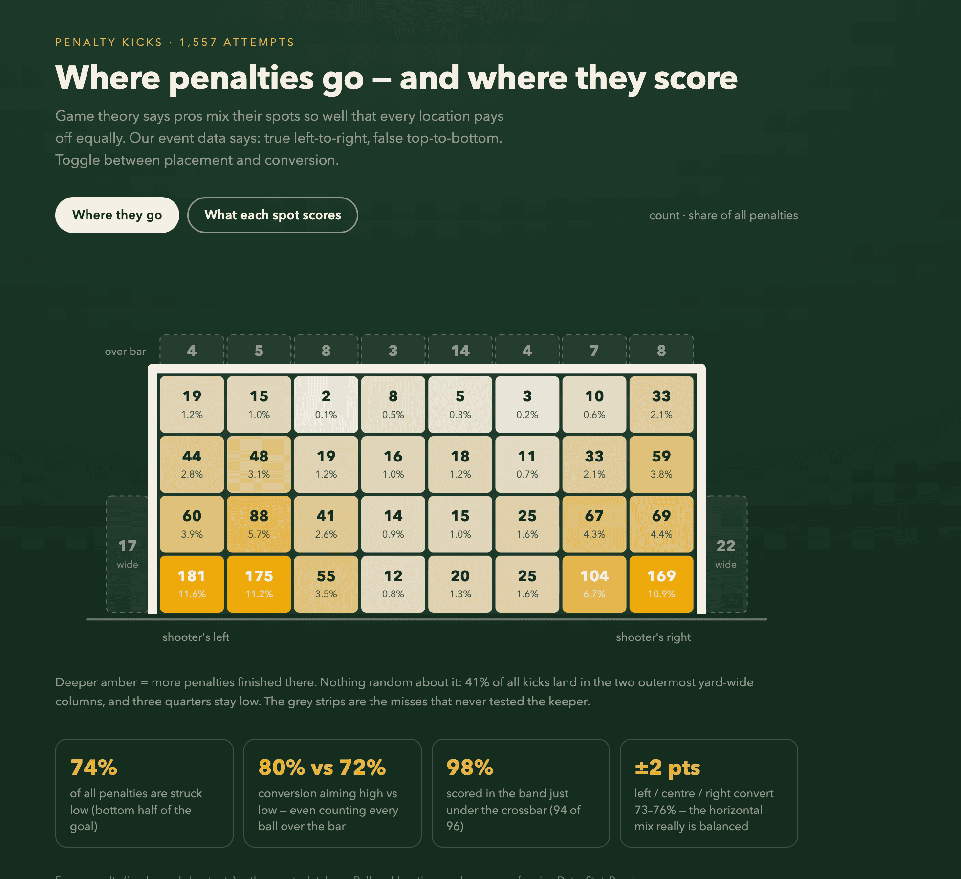
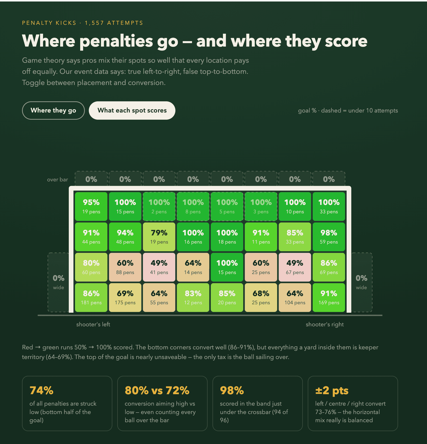
Left to right, the equilibrium is real. Shots to the left convert 72.8%, centre 76.4%, right 75.5%. Across more than 1,500 kicks, a spread of under four percentage points is remarkably flat: exactly what a mixed-strategy equilibrium predicts, and consistent with Palacios-Huerta's studies, which, notably, only ever tested left versus right.
Top to bottom, it breaks down. Players hit the bottom half of the goal 74% of the time, yet low shots convert around 71 to 73% while high shots convert 81 to 83%. Even after charging the high strategy for every ball blazed over the bar (all automatic misses), aiming high still wins, roughly 80% against 72%.
The fine grid explains the mechanism:
- Bottom corners are good, near-corners are not. Balls along the ground into the outermost yard convert 86 to 91%. One yard further inside, conversion collapses to 64 to 69%. That is the keeper's dive radius, drawn in data.
- The top of the goal is nearly unsaveable. Shots that got up there and stayed under the bar almost always scored: the top band went in 94 times out of 96. The tax is missing the frame entirely, and that risk concentrates in the last few inches under the bar.
- The worst place in the goal is shin-to-waist height, roughly 61 to 66%. The most comfortable save a keeper ever makes.
So pros randomize direction like textbook game theorists, and are systematically too conservative on height, trading about eight points of conversion for the comfort of keeping the ball under the bar. Statistically, the Panenka takers and top-bins merchants are the rational ones.
One honest caveat. The data records where the ball ended up, not where the taker aimed, so a scuffed shot gets charged to the wrong strategy. That flatters the low corners and penalises the high rows, which means the real gap in favour of aiming high is, if anything, understated.
The podcast proves it in its own climax
The best part is that the episode's dramatic peak is this exact finding.
2008 Champions League final. Palacios-Huerta writes Chelsea's penalty cribsheet, and his advice against Van der Sar is to go along the ground or high into the top corner, but never mid-height. Anelka hits it mid-height. Saved. Chelsea lose the final.
The best penalty database in the world had already concluded in 2008 what the heatmap above shows: the middle band belongs to the keeper.
So why do pros keep leaving those eight points on the table? Probably because skying a ball over the bar is humiliating in a way "the keeper guessed right" never is. The pattern has company in the literature: Bar-Eli et al. found goalkeepers dive on roughly 94% of penalties even though staying central is statistically optimal, because conceding after action feels better than conceding after standing still.
Everyone on the pitch is optimizing for dignity.
An independent analysis on different data found the same high-versus-low gap we did (25% of kicks high converting 82%, against 75% low converting 74%), so this is not a quirk of one dataset.
Test your own football theory on this data
This was only the penalties. The same StatsBomb dataset has every pass, shot, carry and press across nearly 4,000 matches, so almost any claim you can phrase, you can check. A few worth a look:
- Do teams really score more in the last fifteen minutes, or does it just feel that way?
- Does pressing higher up the pitch actually win the ball back and create more shots?
- Is beating your xG a repeatable skill, or does last season's overperformer regress?
- Do referees add more stoppage time when the home team is chasing the game?
Contextflo makes it a one-minute setup with no database to stand up. The workspace comes pre-loaded with the schema and saved context, so Claude gets the SQL right the first time rather than guessing at column names.
- Go to contextflo.com
- Click sign up / log in
- Log in with your Google or Microsoft account
- On the onboarding screen, pick the football dataset
A ready-to-query BigQuery workspace is created for you, with the tables, schema and goal-frame context already in place.
Connect your Claude
Last step: point Claude at your workspace. Works on Claude Pro or Team.
- In Claude, open claude.ai/customize/connectors
- Click + and choose Add custom connector
- Set Name to
contextfloand URL tohttps://mcp.contextflo.com/mcp - Click Add, then Connect, and authorize with Contextflo
- Start a chat and ask with
@cf, for example,@cf list my tables
On Claude Team, an admin adds the same connector once at claude.ai/admin-settings/connectors, then each member connects.
Event data sourced from StatsBomb Open Data.
Find out if Contextflo is the right fit for you.
See how teams use Contextflo

Related posts
Keep reading
Conversational analytics: 5 ways to set it up, compared
7 min read
How to connect Claude to BigQuery? What works and what doesn't in 2026
8 min read
How to connect Claude to Postgres without giving it write access
7 min read

How to build a BI dashboard with Claude that your team can actually trust
8 min read

How to give Claude read-only access to your database (it isn't always the default)
7 min read

You connected your warehouse to Claude, now what?
5 min read
The official Postgres server for Claude is archived. Here's what to use instead.
7 min read
Why is the team missing sprint goals? How to analyze Jira data with AI
8 min read
Are my ads actually profitable? How to analyze Facebook and TikTok ads together with AI
7 min read