Creating dashboards with AI, live from your data warehouse
Hi, this is Vivek, building Contextflo. I share practical notes on getting answers from your data, a couple of times a month.
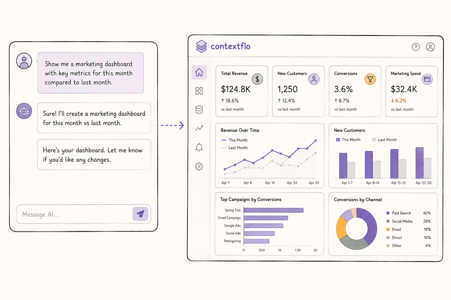
Claude makes beautiful data visualisation artifacts. You get a good understanding of what is happening, and then you have to do it all over again next week.
One of our earlier users worked exclusively in Claude, connected to their data, for reporting visualisations. It worked. But they repeated the whole flow every week, and sharing was awkward: you can share an artifact, but any new variation means redoing it.
So we built dashboards. You ask Claude to create one and it builds a live view that queries your warehouse on every load. Bookmark or share the link and everyone sees current data.
Claude artifacts vs live dashboards
When you ask Claude for a chart it generates an artifact: a self-contained visualisation built from whatever data you gave it in that conversation. Because it has no connection to the database, it cannot refresh itself.
If you have used BI tools you know what you actually want, which is an always-updating dashboard you can return to. You just do not want to build it by dragging rectangles around.
Contextflo dashboards sit in between. Each chart is backed by a live SQL query against your warehouse, so every time someone opens the dashboard the data is fresh, and nothing is cached or stored on our side. Claude handles the visualisation, Contextflo handles the data connection.
| Claude Artifacts | Tableau / Looker | Contextflo | |
|---|---|---|---|
| Data source | Pasted into chat | Connected warehouse | Connected warehouse |
| Live data | No, static snapshot | Yes | Yes, queries on every load |
| How you build it | Describe in chat | Drag and drop | Describe in chat |
| Iterate | Re-prompt from scratch | Manual editing | Tell Claude what to change |
| Share with team | Screenshot or link to chat | Shared workspace | Publish and share link |
| Access controls | None | Role-based | Per-user table scoping |
| Setup time | Seconds | Days to weeks | Minutes |
How it works
Describe what you want. "Create a dashboard showing weekly revenue by region with a filter for product line." Claude uses Contextflo to build the dashboard definition (charts, tables, KPI cards, filters) all wired to live SQL against your warehouse.
Iterate in plain English. Wrong chart type, missing a filter, want bars stacked rather than grouped? Say so and Claude updates the dashboard. You never open a chart library.
Brand it automatically
One thing we did not expect: a customer added instructions telling the LLM to use their brand colours on every dashboard. That was the whole change. Now every visualisation looks like it belongs to their company with no design work. Their performance marketing review used to be assembled by hand from BI screenshots, and is now a dashboard that refreshes itself.
What you can build
It handles the common chart types: line, bar, pie, doughnut, radar, KPI cards and data tables.
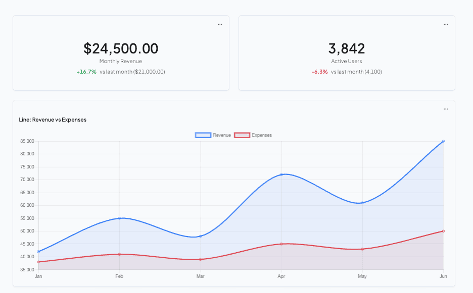
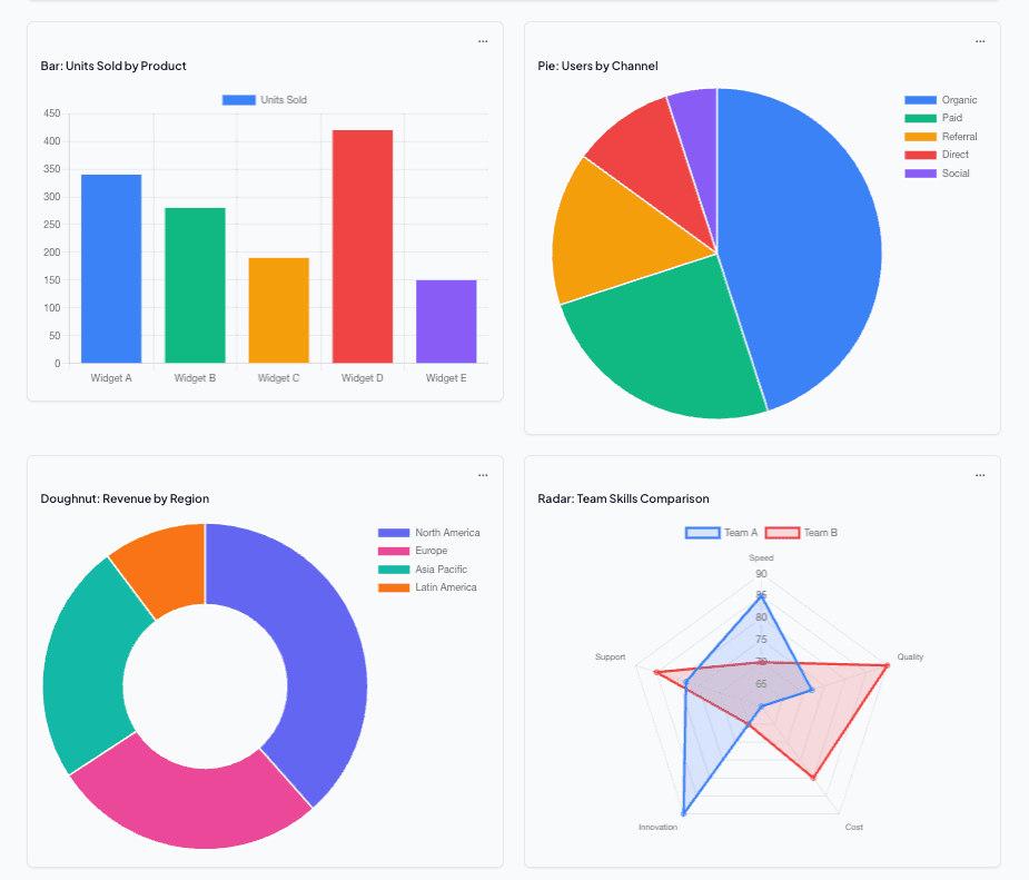
Dashboards support shared filters too: dropdowns or pills that apply across every chart. Filter by date range, region, product line, or any dimension in your data, and Claude sets these up from your schema.
Preview, publish, share
Every dashboard starts in preview. Tweak the layout, verify the numbers, adjust filters. When you are happy, publish it and your team gets a live link rather than a screenshot or a PDF.
That verify step is worth taking seriously the first time. A dashboard is more dangerous than a one-off answer, because it will be opened by people who were not in the conversation where it was built and have no way to know what assumptions went into it.
Your data stays in your warehouse
Every chart queries your warehouse live. Nothing is cached or stored on Contextflo, so each time someone opens a dashboard the queries run fresh. Works with Postgres, BigQuery, Snowflake, Redshift, Databricks and ClickHouse.
Where this fits
Connect your warehouse and ask for something simple to start: "create a dashboard showing our weekly revenue trend." If your team is building dashboards in Tableau or Looker and nobody opens them, this is worth trying instead.
This will not replace your BI suite for a complex pivot table with 50 columns. For the large majority of dashboards, which are three charts and a couple of filters, it does the job and it is faster.
Find out if Contextflo is the right fit for you.
See how teams use Contextflo

Related posts

Keep reading
Conversational analytics: 5 ways to set it up, compared
7 min read
How to connect Claude to BigQuery (and fix the errors you'll hit)
8 min read
How to connect Claude to Postgres (and keep it read-only)
7 min read

How to build a BI dashboard with Claude that your team can actually trust
8 min read
How to give Claude read-only access to your database (it isn't always the default)
7 min read

You connected your warehouse to Claude, now what?
5 min read
What is a semantic layer?
5 min read
How to connect Google Sheets to Claude, and ask it alongside your warehouse
4 min read
A travel company's revenue team stopped opening Power BI every morning
3 min read