How to make charts from a spreadsheet with Claude
You do not need a BI tool to get a chart out of a spreadsheet anymore. You can hand the data to Claude, ask for the chart you want in plain words, and it gives you back an interactive one you can click around in. Here is exactly how, and where it quietly stops being enough.
The basic move
- Open a new chat in Claude.
- Get your data in. Paste the rows straight from Google Sheets or Excel, or drag in a CSV. A few hundred rows pastes fine. For anything bigger, upload the file.
- Ask for the chart in plain words. "Make a bar chart of revenue by month," or "plot signups per week as a line." You write no code.
- Claude renders it as an Artifact, the interactive panel that opens next to the chat. Hover for values. It is a real chart, not a picture of one.
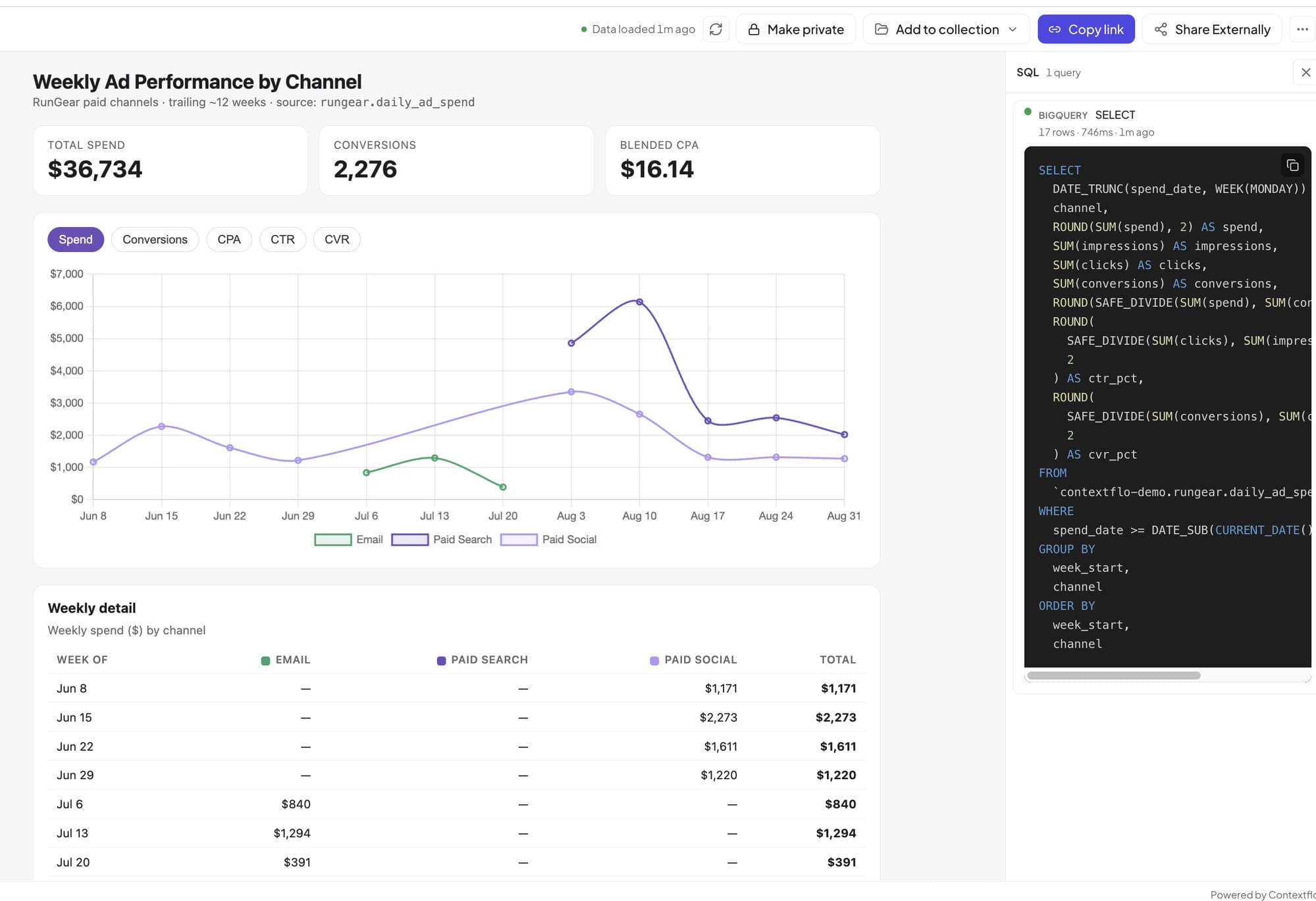
- Change it by asking. "Sort descending," "add a running total," "make it a stacked bar," "color the last month red." Each request updates the same Artifact.
That is the whole loop. A few seconds of typing instead of a pivot table and a chart wizard.
What it is genuinely good at
- One-off questions. You have a file and a question, and you want the picture right now.
- Cleaning as it goes. "The dates are stored as text, parse them," or "ignore the rows with no amount." It fixes the data in the same breath as it draws the chart.
- Small dashboards. Ask for three charts and a couple of headline numbers, and it will lay them out together in one Artifact.
- Reading the chart back to you. It will point out the outlier you skimmed past and tell you what the shape actually means.
The first time I tried it I pasted the same CSV in twice before realizing I was looking for a refresh button that does not exist. Which is the real story here.
Where it stops working
- It is a snapshot. The chart only knows the rows you pasted. Tomorrow's data is not in it, and there is nothing to refresh. You paste again.
- Bigger data hits a wall. Past a few thousand rows the paste gets clumsy and the upload gets slow, because Claude is reasoning over a file, not querying a database.
- It cannot reach where your data lives. Your numbers sit in a warehouse, or in Shopify, or in a Sheet that changes every morning. On its own, Claude cannot touch any of that.
- Sharing and trust land on you. The Artifact lives inside your chat. There is no agreed definition of "revenue," no access control, and no one else looking at the same current number.
None of that makes it useless. It makes it a fast scratchpad, which is exactly what a lot of questions deserve and nothing more.
When you want it to stay live
The moment you want that same chart to answer with today's numbers, or to sit on top of your real data instead of a copy you pasted last Tuesday, you have crossed from a one-off into something you have to maintain. That is the job a governed layer does: it connects Claude to where the data actually is, your warehouse or a CSV you upload once, keeps it current, and lets the rest of your team ask the same question and get the same answer. Connecting Claude to BigQuery is the setup step. The chart still being right next week is the whole point of it.
You can feel the difference without wiring anything up. The playground runs against a real dataset of about 50 million rows, no login. Ask it for a chart, then remember that the spreadsheet version knew only the rows you happened to paste.
A chart from a spreadsheet is a few-second trick now. A chart you can still trust next week is a different job.
See it on your own data.
Connect your warehouse and your team can ask Claude about it the same day, without waiting on a data team. Want a walkthrough first? Grab 20 minutes.
Book a 20-minute callSee how teams use Contextflo

Related posts

Keep reading
Conversational analytics: 5 ways to set it up, compared
7 min read
How to connect Claude to BigQuery? What works and what doesn't in 2026
8 min read
How to connect Claude to Postgres without giving it write access
9 min read

How to build a BI dashboard with Claude that your team can actually trust
8 min read
How to give Claude read-only access to your database (it isn't always the default)
7 min read

You connected your warehouse to Claude, now what?
5 min read
ClickHouse MCP: how to connect ClickHouse to Claude, Cursor or Codex
6 min read
Query BigQuery from the Codex CLI with MCP
5 min read
Run ClickHouse queries from Codex with MCP
6 min read