Still building the weekly KPI report by hand? How to automate it with Claude
Hi, this is Vivek, building Contextflo. I share practical notes on getting answers from your data, a couple of times a month.
A weekly KPI report is five to eight numbers, each with a written definition, shown against last week, the same week last year and a target, plus two or three sentences on what changed and why. That's all leadership needs from it. Automating it works in four stages: fix the definitions, give each metric one source query or tab, let Claude draft the commentary, then schedule delivery. Do them in that order. Automating a report whose numbers nobody checks just sends the wrong number on time.
What belongs in the report
Most weekly reports grow by accretion until nobody reads past the first screen. A good one has:
- A short list of metrics. Five is plenty for most teams, eight is the ceiling.
- A one-line definition for each, written where the reader can see it. "Revenue" means gross or net? Before or after refunds? Which timezone does the week end in?
- Four numbers per metric: this week, last week, same week last year, target.
- Two or three sentences of commentary saying what moved and whether anyone needs to act on it.
The same-week-last-year column is the one people drop, and it's the one that stops you panicking about a seasonal dip. Match weeks by week number (Monday to Sunday, week 39 against week 39) rather than by date, so you compare the same weekdays.
Why the Monday-morning version keeps breaking
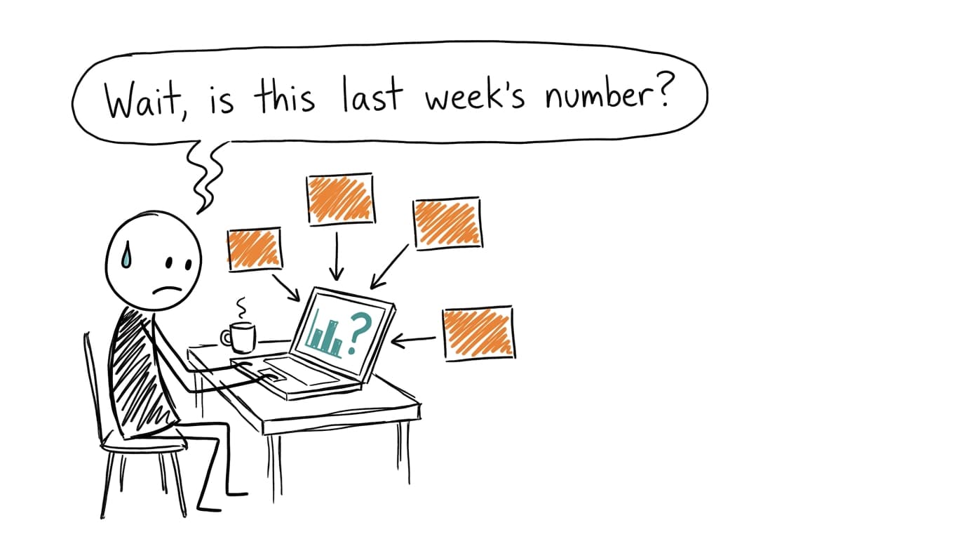
A post on r/analytics describes the failure better than any checklist. An automated formula in a weekly report didn't refresh, and a category that was down 14% went to every VP as up 34%.[1] Nobody caught it because the number looked plausible.
That's the pattern. The report gets assembled by copying from four tools (the store, the ad platforms, the CRM, a finance sheet) into one spreadsheet, and each copy is a chance to paste last week's export. The definitions drift too. Revenue in January excluded shipping; by June someone's formula includes it, and the trend line has a step in it that isn't real. Then the commentary gets written from scratch every Monday, usually by the same tired person at 8:40am, so it describes the numbers instead of explaining them.
None of this is fixed by a better template. It's fixed by making each part of the report something you set up once.
Automate it in four stages
1. Write the definitions down once
Before touching any tool, write a short block like this and keep it with the report:
Week: Monday 00:00 to Sunday 23:59, America/New_York.
Net revenue: order totals minus refunds processed that week,
  excluding shipping and tax. Source: Shopify orders.
Orders: paid orders, excluding test orders and $0 orders.
New customers: customers whose first paid order is in the week.
Refund rate: refunds processed / orders, same week.
This block does double duty. It stops the numbers drifting, and it's the most useful thing you can paste into an AI prompt later.
2. One query or one tab per metric
Each metric should come from exactly one place: a saved query, a Google Sheet tab, a pivot on a single export. If revenue appears in three tabs with three formulas, you'll eventually report the wrong one. When a number looks off, you want one place to check.
3. Let Claude draft the commentary, and keep a human sign-off
Writing "revenue up 6%, driven by order volume" is exactly what a model does well, and it's the part people dread. What a model can't know is anything outside the data. Someone still reads the draft and fixes the sentence that's wrong for a reason only the business knows. The worked example below is one of those.
4. Schedule delivery last
Only once the numbers have matched your manual version for a few weeks. Scheduling earlier just automates the VP story.
The quick way: a Google Sheet and a Monday prompt
Keep one sheet with two tabs. A definitions tab holds the block above. A weekly tab holds one row per week and one column per metric, filled from your exports or from tabs that pull from them. Keep last year's weeks in the same tab so the year-over-year comparison is a lookup, not a hunt.
Then every Monday, upload the sheet as a CSV to a Claude chat, or link it through the Google Drive connector, and run a saved prompt:
This sheet has our weekly KPIs, one row per week. Definitions are
below and are the only definitions to use.

[paste definitions block]

For the most recent complete week, give me a table with each metric:
this week, last week, % change, same week last year, % change, and
target, with the gap to target.

Before anything else, flag any metric where this week's value is
identical to last week's, or more than 30% away from both last week
and last year. Those may be stale or broken inputs.

Then write 3 sentences of commentary for leadership: what moved most,
the likely reason visible in the data, and anything that missed target.
Don't guess at causes the data doesn't show. Say "unclear from the data"
instead.
The stale-value check is the line that would have caught the formula that didn't refresh, and I'd keep it in the prompt even after everything else is automated. The "don't guess" line keeps the commentary from inventing a reason. If a number moves and you want the actual cause, why did my sales drop walks through breaking it down.
Can Claude run this for you every Monday?
Partly. Claude Cowork has scheduled tasks on its paid plans, so check Anthropic's current plan requirements. You set a prompt to run hourly, daily, weekly or on weekdays, and it runs remotely even when your computer is asleep, using your connectors and files saved to your Claude account.[2] Claude Code also has routines that run on a schedule in the cloud, but they're built around code repositories and are in research preview.[3] ChatGPT has its own scheduled tasks feature as well.
The catch is the sheet. A scheduled prompt re-reads whatever data it can reach; it doesn't re-export your store or your CRM. If the tab behind it is stale, you get a well-written summary of the wrong week. So with this setup, the manual step moves from writing the report to refreshing the inputs, and you still read the draft before forwarding it.
Where Contextflo takes over part of it
Contextflo's scheduled reports run against your data at send time, not a stale copy. Describe the report in Claude or ChatGPT, pick a cadence (daily, weekly, monthly or a custom schedule, in your timezone), and at that time an agent works through your connected warehouse, database, sheets and uploaded files, writes up what it found with charts, and delivers it by email or to a Slack channel.
The definitions from stage 1 go in as saved metrics, so "net revenue" means the same thing in week 39 as it did in week 12, and every run keeps a record of what it checked so the commentary is checkable, not just plausible. How to automate recurring data reports with AI covers setup and prompt writing in detail.
Two habits carry over from the manual version: deliver the first few runs to yourself or a private channel so you can read them before leadership does, and keep a person signing off the commentary before it goes out for real.
The full setup
If the KPI report pulls from more than a couple of systems, the durable fix is a warehouse. Sync the store, CRM, ad platforms and billing into BigQuery, Snowflake or Postgres with Fivetran or Airbyte, then write each metric once as SQL. From there, most BI tools can email a dashboard on a schedule, or you can point a scheduled report at the same tables. It's more setup, but it removes the export step entirely, which is where stale numbers come from. Claude with BigQuery shows the query side.
Worked example: five metrics and one number a human caught
The numbers are made up for illustration. An online store's ops lead sends leadership a report every Monday for the week ending Sunday, week 39.
| Metric | This week | Last week | Same week last year | Target |
|---|---|---|---|---|
| Net revenue | $182,400 | $171,900 | $158,300 | $175,000 |
| Orders | 2,310 | 2,240 | 2,105 | 2,250 |
| Average order value | $78.96 | $76.74 | $75.20 | $77.00 |
| New customers | 640 | 702 | 655 | 700 |
| Refund rate | 1.2% | 4.1% | 3.8% | under 4% |
Claude's draft commentary:
Net revenue beat target at $182,400, up 6.1% on last week and 15.2% on the same week last year, driven by more orders and a higher average order value. New customers fell 8.8% to 640 and missed target, so growth came from returning buyers. Refund rate improved sharply to 1.2%, well under target.
Every sentence is accurate to the table. The ops lead changed the last one anyway. Two of the three people who process returns were out that week, and refunds are counted when they're processed, not when they're requested. About 90 requests were sitting in the queue. The refund rate didn't improve; it was postponed, and next week's refunds will spike and pull net revenue down with them.
The sent version said so in one line, and the definitions block got a note: "Refund rate reflects processing, not requests. Check the returns queue before reading it." Claude described the number correctly. Only someone who knew who was on holiday could tell the number was wrong.
FAQ
How do I automate a weekly KPI report? Do it in stages. Write down each metric's definition once, including what counts and which week boundaries you use. Give each metric one query or one sheet tab that produces the number. Then let an AI model like Claude draft the comparisons and the short commentary from those numbers, and have a person read it before it goes out. Schedule delivery last, once the numbers have been right for a few weeks.
Can Claude run a report automatically every week? Yes, with limits. Claude Cowork has scheduled tasks on its paid plans that run hourly, daily, weekly or on weekdays, and they run remotely even when your computer is asleep, so check Anthropic's current plan requirements for scheduled tasks. A scheduled prompt only re-reads the data it can reach, though, so if the sheet behind it didn't refresh, you get a confident write-up of last week's numbers.
What should a weekly KPI report include? Five to eight metrics, each with a one-line definition. For each one: this week, last week, the same week last year, and the target. Then two or three sentences on what changed and why. Anything longer tends not to get read.
Can AI write the commentary for a KPI report? It can draft it well from the numbers, but it only knows what's in the data. It can't know that the returns team was short-staffed or that a promo email went out a day late. Treat the AI commentary as a first draft and have the person who owns the report sign off before it's sent.
Find out if Contextflo is the right fit for you.
See how teams use Contextflo

Related posts



Keep reading
Conversational analytics: 5 ways to set it up, compared
7 min read
How to connect Claude to BigQuery (and fix the errors you'll hit)
8 min read

How to connect Claude to Postgres (and keep it read-only)
7 min read

How to build a BI dashboard with Claude that your team can actually trust
8 min read

How to give Claude read-only access to your database (it isn't always the default)
7 min read

You connected your warehouse to Claude, now what?
5 min read
Why we built our own Postgres MCP server
7 min read

Which closed deals churned within a year? How to connect HubSpot and Stripe with AI
8 min read
Is your retention improving? How to run a cohort analysis with AI, no SQL
8 min read